blog | twitter | tutes | about
Creating a Simple
Responsive Design
Web Page
What you will learn:
Prerequisites:
Required time:
Approximately 1 hour
Notes
Our goal is to make a simple webpage containing a banner, a paragraph of text and an image, and then format the page so that it will resize to fit any size screen, including mobile devices. Although we will build a simple page, you will learn a basic technique – media queries – that you can use with more complex projects and pages.
* You can view a working example at http://flashbynight.com/tutes/responsivedesign/example/ and download the completed source files here
* You can view a working example here and download the completed source files here
Step 1 - Setting up the HTML document
Although you could use Dreamweaver or similar software, to create an HTML document, you don’t need any special software, you can simply use any text editor such as Textpad or Wordpad. Open your text editor and type:
This is the way that we begin all of our HTML5 documents. Now let’s fill out the document structure:
<!DOCTYPE HTML>
<head>
</head>
<body>
hello
</body>
</html>
Save the document as index.html. Test it out by opening it in a browser (right-click and choose Open With and choose a browser).
Step 2 – Adding the page content
So far, it’s a webpage that says hello! Well, that’s not so useful. In between the body tags (<body> … </body>), add the following:
<body>
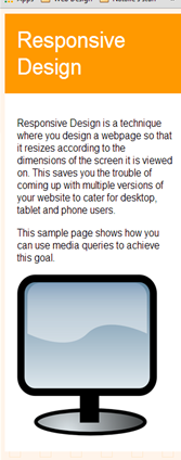
<div id="title"> Responsive Design</div>
<div id="content">
<p>Responsive Design is a technique where you design a webpage so that it resizes according to the dimensions of the screen it is viewed on. This saves you the trouble of coming up with multiple versions of your website to cater for desktop, tablet and phone users.</p>
<p>This sample page shows how you can use media queries to achieve this goal.</p>
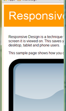
<imgsrc="Picture1.png" >
Content on a webpage is separated by ‘divs’. We have two divs here, one with the id ‘title’, which will be our page title and one with the id ‘content’, which will hold the page content: some text and an image.
For the image to appear, you need to have a png image file with the name Picture1.png in the same folder location as your index.html page.
Use the following image (right-click and choose ‘save as’ and save it in the correct file location):

Now, between the <head>…</head> tags, add the following:
<head>
<title>Responsive Design Example</title>
<meta name=viewport content="width=device-width, initial-scale=1.0, maximum-scale=1.0, user-scalable=no ">
<link href="style.css" rel="stylesheet" type="text/css" />
</head>
The <head> tags generally contain information about the page, rather than adding content to the page. The text in between the <title> tags will show up on the browser tab. In the meta tag, we add a line of code that ensures content will scale to a mobile device instead of 'squashing' the page to fit into the screen.
Finally, we point our page to a CSS Stylesheet. Sounds complicated? It’s just a document that holds style information about the page margins, background colors and so on. We usually want this in a separate document so that we can reference the same stylesheet for many different pages on a site.
Step 4- Creating and writing the style.css document
Once again, you don’t require any special software to create a stylesheet. You can simply open a blank text document and save it as style.css – make sure the .txt file extension is replaced by .css. Again, this must be in the same folder location as your index.html file.
Let’s add some style to the page:
html body{
font-family: arial;
background-image:url(bg.png);
}
Our first tags lay out style for the entire body of the page. We want to switch all the text on the page to Arial and we want a background image.
Use the following for the background image (right-click and choose Save As and save it to the same folder as index.html with the name bg.png):

Now save and open index.html in your browser again. Notice the background and the font?
Let’s continue. After (not inside) the previous tags, add the following:
#title{
width:800px;
margin:auto;
background-color:#ff9900;
color:#FFFFFF;
font-size:50px;
padding:20px;
}
The hashtag (#) means we are referring to a div in the html document. So the style described here applies to whatever is contained within <div id=”title”></div>
.
We specify that our div will be 800 pixels wide with an automatic margin on either side. This means it will be centered on the screen. It will have an orange background color with white text. Any text within the div will have a size of 50 pixels. Anything within the div will have a ‘padding’(an inner margin) of 20 pixels.
Save and reopen or refresh index.html in your browser. Note the changes to the page title.
Next:
#content{
width:800px;
margin:auto;
background-color:#FFFFFF;
padding:20px;
}
#content img{
width:400px;
}
We set the same width for the content as for the page title, centered again for continuity. We need our text to stand out, so we add a white background. Again we add padding of 20 pixels.
#content img{…}
Anything within these tags will be applied to all images within the content div. We set a width of 400 pixels and the height will automatically adjust in ratio. This means all images (if we decided to add more) can be standardized with a width of 400 pixels – handy for page control.
Save and reopen and refresh your browser. The page looks pretty good. That’s what we want! Unfortunately, it won’t look nice in a mobile browser… yet. That’s the final (and easy!) part of the tutorial.
Step 5 - Adding Media Queries
You can test whether any website has responsive design. Simply resize your browser down to mobile size.
So far, if we resize our browser, we get this:
That’s no good. It will look terrible when viewed on a phone.
So what we need to do is to use Media Queries. Media queries go in our CSS document and set breakpoints where the style of the page changes according to the browser (or device) width. We can also set style changes according to height if we want.
Firstly, we have set the title and the text to have widths of 800 pixels. Obviously, if the screen is less than 800 pixels, there will be overflow.
So at the end of our CSS document, let’s add these lines:
@media screen and (max-width:800px) {
#title{width:90%;}
#content{width:90%;}
}
This tells the browser to use the following styling up to a maximum width of 800px. (Therefore, 800px is our first breakpoint.)
Up until 800px, the #title and #content divs, instead of being 800px wide, should be 90% of the available space.
Save and test it. It looks good except for a couple of things. The title text is too big and looks odd when the screen is smaller. And our image still needs resizing.
Our second breakpoint should be 440px. Why? Because our image is 400px wide with 20px padding on either side. And we may as well use this breakpoint to resize the font for the title text too.
Here we go:
@media screen and (max-width:440px) {
#content img{width:90%;}
#title {font-size:35px;}
}
So up to 440px, any image within the content div will take up 90% of the available space and the font size for the title will be 35.
Test it out. Doesn’t it work nicely? Try it is different sizes by dragging and resizing your browser. At smartphone width, you should see:
Test it out on a phone or tablet if you have the chance!
--- THE END ---
Remember to check out more tutorials at FlashbyNight.com/tutes
We also have some great games for you at FlashbyNight.com
Happy coding!